Accessible modal dialogs using inert
inert is a new HTML attribute that makes it easy to disable and restore user input events for an element and all its children. With this attribute, it’s easier than ever to create intentional focus traps and accessible modal dialog interactions.
Sometimes it’s important to prevent users from interacting with parts of your page. If you open a modal dialog you want users to only be able to interact with content inside of the dialog, not buttons or inputs elsewhere on the page.
Maybe you’ve been in a scenario where you’ve encountered some hidden elements that are still focusable when you tab to them. This is a confusing experience when navigating with the keyboard and it should be avoided.
Introducing inert
inert is an HTML attribute that makes the browser ignore events from elements within it, including focus and events from assistive technology. Some browsers also ignore page search and text selection in the element.
<div>
  <button>🤠 Click and focus</button>
</div>
<div inert>
  <button>🥶 I can't be clicked or focused</button>
</div>
Inert means not able to move or act. When elements in the DOM are inert you cannot interact with them.
Keep in mind that inert makes entire HTML subtrees
inaccessible, so use it with care! 🙏
Let’s look at a common use-case for inert by making an accessible modal dialog.
Example use-case: making an accessible modal dialog
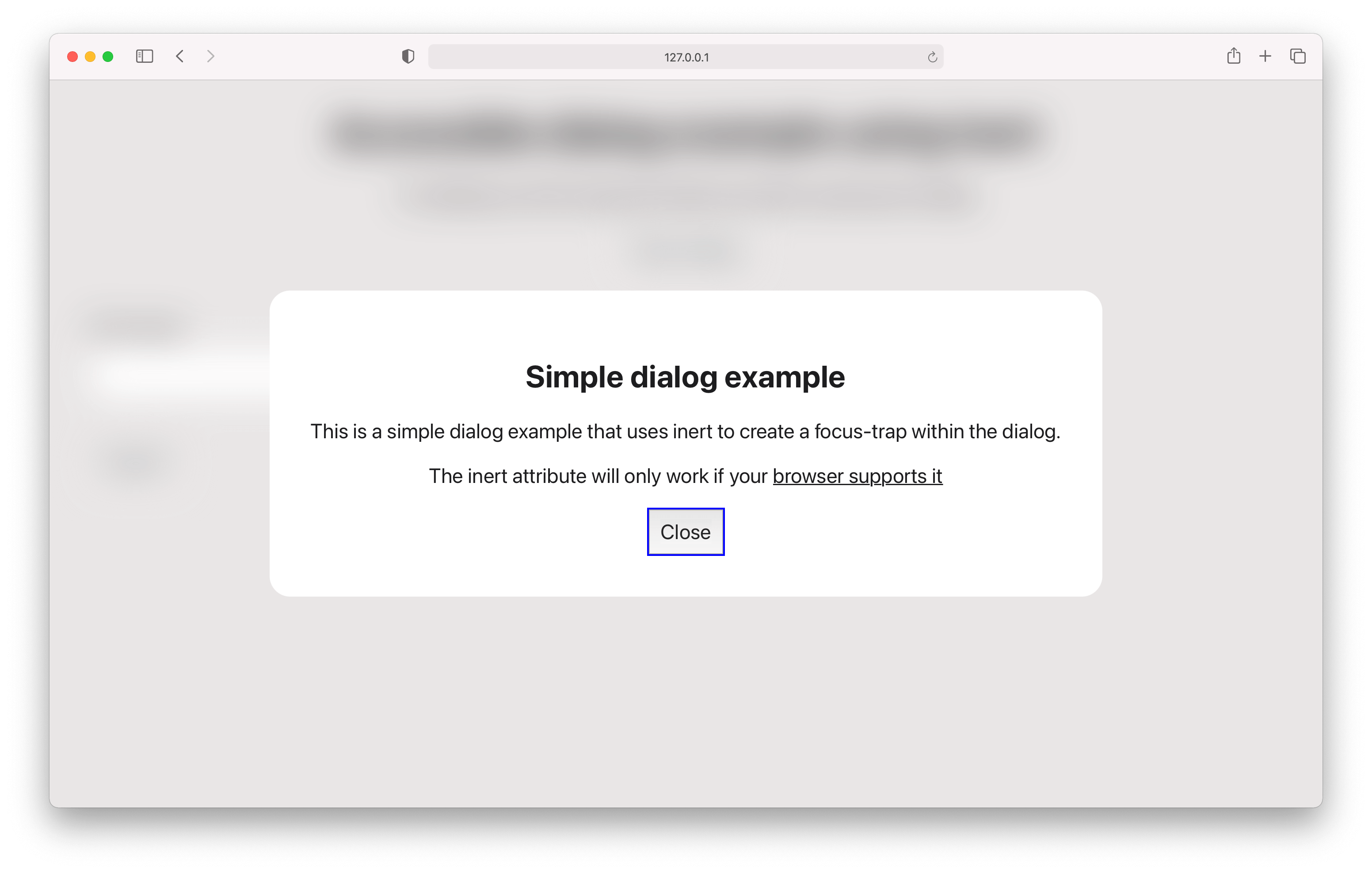
Modal dialogs are windows of content that overlay the page or other dialogs. Some of the main concerns when making accessible dialogs is to ensure that it's announced to assistive technology when opened, and that focus and tab sequences are managed correctly.

Check out the GitHub repo for the full implementation, or read on for a breakdown of the approach.
Criteria and best practices for accessible dialogs:
- The element that is the dialog has
role="dialog" - The element that is the dialog has
aria-modal="true" - When open, everything outside of the dialog is inert
- When open, tabbing cycles focus only within the dialog
- When open, obscure all content outside the dialog with styling
- When open, pressing Escape closes the dialog
Titles
- Dialog has a visible title: add
aria-labelledbythat that refers to the title - Dialog with no title: add
aria-labelwith a suitable title
Descriptions
- Dialog has a visible description: add
aria-describedbythat refers to the description - Dialog has semantic content: (like lists, tables or multiple paragraphs) don't add
aria-describedby
Example markup
<body>
  <div
    role="dialog"
    id="dialog1"
    aria-labelledby="dialog1Title"
    aria-describedby="dialog1Description"
    aria-modal="true"
    class="dialog"
  >
    <h2 id="dialog1Title">Title</h2>
    <p id="dialog1Description">Description</p>
    <div class="dialog__actions">
      <button>Close</button>
    </div>
  </div>
  <main inert>
    <!-- cannot be keyboard focused or clicked -->
  </main>
</body>
Dialog focus management
Effective and sensible focus management is an important aspect of accessibility that often adds a fair amount of complexity. Disregarding focus can make keyboard and screen reader navigation difficult, confusing or completely impossible in the worst cases.
Figuring out which elements that can or cannot receive focus as well as when and where you must activate focus can make or break the user experience.
Opening the dialog
When opening a dialog, focus must be moved to an element within the dialog. The element within the dialog that receives focus is dependent on the dialog contents.
Refer to the table below to determine which element to focus on when opening a dialog:
| Dialog contains | Focus on |
|---|---|
| Semantic content like lists, tables or multiple paragraphs | Title or description at the beginning using tabindex="-1". Do not use aria-describedby |
| Long form content followed by something interactive. Seeing the interactive element cause the long form content to scroll out of view. | Title or description at the beginning using tabindex="-1" |
| The final step in a destructive or hard to reverse action | The least destructive action |
| Limited content or interactive elements | The element that is most likely to be used, like a “Continue” or “Close” button |
| Anything not mentioned above | The first focusable element |
Closing the dialog
When closing a dialog, focus should ideally be moved back to the element that opened the dialog. However, there are scenarios where moving focus to another element makes more sense.
See the table below to choose which element should recieve focus when closing a dialog:
| Scenario when closing | Focus on |
|---|---|
| The element that opened the dialog still exists | The element that opened the dialog |
| A task was completed in the dialog and it directly relates to a next step | Title or description for the next step using tabindex="-1", or a focusable element in the next step. |
| It is highly unlikely you need to open the dialog again | The next logical element |
| Anything not mentioned above | The most logical element |
"Logical element" refers to whatever element is the most descriptive or relevant, dependent on the current task being performed or the context of the page.
Putting it all together in React
function App() {
  const [isDialogOpen, setIsDialogOpen] = useState<
    boolean | null
  >(null)
  const dialogOpenerRef = useRef<HTMLButtonElement>(null)
  const dialogActionRef = useRef<HTMLButtonElement>(null)

  const toggleDialog = () => setIsDialogOpen(!isDialogOpen)

  const handleKeyboard = useCallback(
    (event: KeyboardEvent) => {
      if (isDialogOpen && event.key === 'Escape') {
        setIsDialogOpen(false)
      }
    },
    [isDialogOpen]
  )

  // Global "Escape" listener
  useEffect(() => {
    document.addEventListener('keydown', handleKeyboard)

    return () => {
      document.removeEventListener('keydown', handleKeyboard)
    }
  }, [handleKeyboard])

  // Focus management
  useEffect(() => {
    if (typeof isDialogOpen !== 'boolean') return

    if (isDialogOpen) {
      dialogActionRef?.current?.focus()
    } else {
      dialogOpenerRef?.current?.focus()
    }
  }, [isDialogOpen])

  return (
    <div className="App">
      <div
        role="dialog"
        id="dialog1"
        aria-labelledby="dialog1Title"
        aria-modal="true"
        className={`dialog ${isDialogOpen ? 'dialog--open' : ''}`}
      >
        <h2 id="dialog1Title">Simple dialog example</h2>
        <button onClick={toggleDialog} ref={dialogActionRef}>
          Close
        </button>
      </div>

      <main inert={isDialogOpen ? '' : undefined}>
        <h1>Accessible dialog example using inert</h1>
        <button onClick={toggleDialog} ref={dialogOpenerRef}>
          Open dialog
        </button>
        {/* ...other interactive elements */}
      </main>
    </div>
  )
}

export default App
Check out the GitHub repo for the full implementation.
