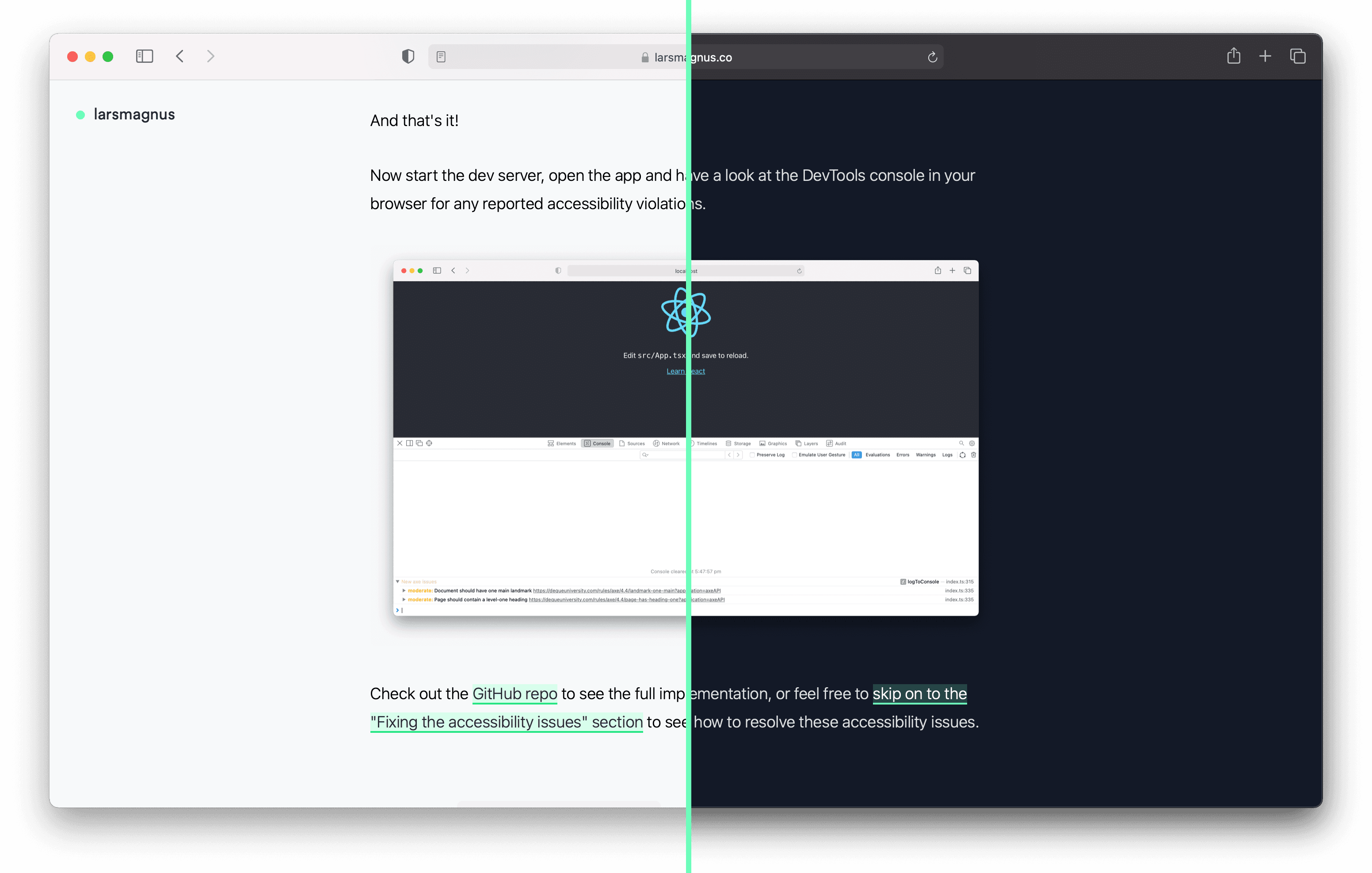
How to make images react to light and dark mode
With a custom theme toggle, you're able to switch the colour scheme on your website between light and dark mode, but images and icons are usually left unchanged which can make them look out of place. Let's break down how to make theme-reactive images, icons and favicons to ensure you're offering your audience the most enjoyable experience possible.
Theme switches that transform the look and feel of apps are now ubiquitous. Changing the colour scheme on the fly is a wonderful quality of life feature, but images are often left unchanged even when they are hard to see or look completely out of place in one of the colour modes.

If you're an avid dark mode user you will likely have burned your retinas when a stark white image jumped out at you while browsing an app. In light mode, you may have encountered gloomy images on an otherwise vibrant website.
Next up, you'll learn how to change your images and icons to match a website's colour scheme, starting with raster image formats like .png and .jpg.
Images using <picture>
The <picture> element is quite powerful as it enables conditional loading and rendering of images using the media attribute on any of its <source> elements.
<picture>
  <source
    srcset="dark-image.png"
    media="(prefers-color-scheme: dark)"
  />
  <img
    src="light-image.png"
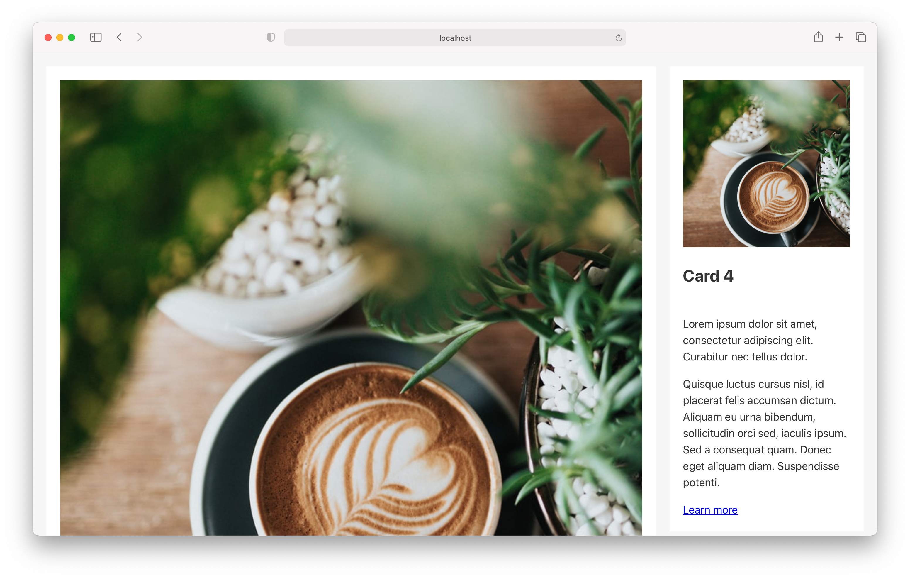
    alt="Browser with large and small images of a coffee cup and plants"
  />
</picture>
In this example, the prefers-color-scheme CSS media feature is used to only show the dark-image.png if the condition of media evaluates to true. If the condition is false or if picture is unsupported, light-image.png will be displayed.
See this in action on the image below by or by changing your device settings.

Making images react to theme mode toggles
If you try on this site you'll see that the image dynamically changes as you change between dark and light modes. However, there's a catch. This is not the default behaviour when using prefers-color-scheme on a <source> element!
prefers-color-scheme only respond to device settings, not your custom theme switcher
By default, CSS and images targeted by prefers-color-scheme are only affected by your device settings, even if you've implemented a custom theme switcher. There's also no way for you to override the device settings or force the value of prefers-color-scheme from the browser.
This means you may run into a situation where if your device is set to dark mode and the site you're viewing is set to light mode, then the images you'll see are the ones matching media="(prefers-color-scheme: dark)".
As a result, implementing a manual dark/light theme toggle button to switch colour themes for a website on the fly, simply using @media (prefers-color-scheme: dark) won't work.
/**
* This only works if changing the device's colour preference,
* not with a custom theme toggle, and the same applies to images
*/
:root {
  --color-text: #070f1c;
}

@media (prefers-color-scheme: dark) {
  :root {
    --color-text: #dae0e5;
  }
}
How theme switchers get around device settings
To circumvent this constraint, manual theme toggles usually rely on updating data attributes or class names on the <html> or <body> tags to allow you to target and manage the CSS used for dark and light themes.
/**
* This works with a custom theme toggle,
* regardless of what the device's colour preference is
*/
:root {
  --color-text: #070f1c;
}

:root[data-theme='dark'] {
  --color-text: #dae0e5;
}
When you override the theme on your site by changing between <html data-theme="light"> and <html data-theme="dark">, you'll see the CSS change, but your images will remain the same.
Similarly as with CSS the media="(prefers-color-scheme: dark)" attribute on <source> elements only respect device settings, and you can't use CSS selectors inside the <source> element's media attribute to force the element to obey [data-theme].
Reactive images by toggling media="all" and media="none"
To implement fully reactive dark mode images you need to use a bit of JavaScript. The approach below works by setting media="all" on images that match the current colour theme, and media="none" on those that don't.
This is just an approach for showing/hiding image sources based on the colour scheme! It doesn't cover how to create a custom theme toggle. ✌️
/**
 * Make <picture> <source> elements with media="(prefers-color-scheme:)"
 * respect custom theme preference overrides.
 * Otherwise the `media` preference will only respond to the OS-level setting
 */
const updateSourceMedia = (
  colorPreference: 'light' | 'dark'
): void => {
  const pictures = document.querySelectorAll('picture')

  pictures.forEach((picture) => {
    const sources: NodeListOf<HTMLSourceElement> =
      picture.querySelectorAll(`
        source[media*="prefers-color-scheme"],
        source[data-media*="prefers-color-scheme"]
      `)

    sources.forEach((source) => {
      // Preserve the source `media` as a data-attribute
      // to be able to switch between preferences
      if (source?.media.includes('prefers-color-scheme')) {
        source.dataset.media = source.media
      }

      // If the source element `media` target is the `preference`,
      // override it to 'all' to show
      // or set it to 'none' to hide
      if (source?.dataset.media.includes(colorPreference)) {
        source.media = 'all'
      } else if (source) {
        source.media = 'none'
      }
    })
  })
}
Following this, you need to use updateSourceMedia with a theme toggle at the point where the colour scheme is first set, and when it changes.
As an example, here's how this would work with the excellent <dark-mode-toggle> custom element by Google.
const toggle = document.querySelector('dark-mode-toggle')

document.firstElementChild.setAttribute('data-theme', toggle.mode)

toggle.addEventListener('colorschemechange', () => {
  document.firstElementChild.setAttribute(
    'data-theme',
    toggle.mode
  )
  updateSourceMedia(toggle.mode)
})
That should do it! Now you'll show the appropriate image based on your site's custom colour mode. Let's continue to SVG's and favicons.
Inline SVGs
Handling SVGs are thankfully a lot more straightforward. You simply have to weigh up a few different approaches based on your preferences and needs:
- External styles using CSS variables
- External styles using
currentColor - Consider the
<use>element for reusability and with external file references - Embedded styles
SVG files intended to be used with <img> should likely use the "Images using <picture>" approach mentioned previously.
External styles using CSS variables
Taking advantage of CSS variables will give you a flexible and maintainable approach that allows you to keep your code DRY by reusing variables across stylesheets and SVGs.
:root {
  --color-primary: #000000;
}

:root[data-theme='dark'] {
  --color-primary: #dae0e5;
}<svg viewBox="0 0 60 60">
<path d="..." fill="var(--color-primary)" />
</svg>See this in action on the SVG below by or by changing your device settings.
External styles using currentColor
The special currentColor keyword lets you use the value of color for other properties that accept a colour value. This approach can often be useful when managing a design with text and SVGs that should have the same colour.
.logo {
  color: black;
}

[data-theme='dark'] .logo {
  color: white;
}<svg viewBox="0 0 60 60" class="logo">
<path d="..." fill="currentColor" />
</svg>Consider the <use> element for reusability and with external file references
<use> is an SVG element that allows you to duplicate parts of an SVG, or an entire SVG, and reuse the contents somewhere else.
<svg viewBox="0 0 30 10" xmlns="http://www.w3.org/2000/svg">
  <!-- Same-file reference -->
  <circle id="circle" r="4" fill="blue" fill-opacity="0.2" />
  <use href="#circle" x="10" fill="red" stroke="red" />
  <!-- Since fill="blue" is already set on <circle>,
  fill="red" will be ignored, but stroke="red" works. -->

  <!-- External file reference -->
  <use href="/images/icon-circle.svg#svg" x="20" stroke="green" />
</svg>
When <use> duplicates a file, several of its attributes like fill and stroke can be set from outside of the source file if they haven't already been defined.
You can also opt to add dynamic properties like currentColor or CSS variables inside the source file, and the properties will still inherit any values that are set in the context where you use the file.
<svg viewBox="0 0 60 60" id="svg">
  <path d="..." fill="var(--color-primary)" />
</svg>
Using logo.svg on a HTML page as an external reference:
<svg viewBox="0 0 60 60">
  <use href="/logo.svg#svg" />
</svg>
This won't work without a fragment
identifier, for example
href="logo.svg#svg".
The identifier is used to target the part of the SVG you want to render, and it points to an id in the source file. You can add one or more ids to the SVG itself or any of its children.
You may want to consider either of these approaches when you're making reusable images like icons, and want the option to change some colours by using a stylesheet or through attributes on the element. 🔥
Embedded styles
As a last option, all of your styles can be embedded within an SVG. This is not as easy to maintain, but in some cases, this may be your only viable approach.
<svg viewBox="0 0 60 60">
  <style>
    .logo {
      fill: black;
    }

    [data-theme='dark'] .logo {
      fill: white;
    }
  </style>
  <path d="..." class="logo" />
</svg>
Favicons
Link elements also support the media attribute in most browsers, which makes dark mode favicons easy to implement.
<link rel="icon" href="/favicon.svg" />
<link
  rel="icon"
  href="/favicon-dark.svg"
  media="(prefers-color-scheme: dark)"
/>
Keep in mind that it's also possible to use the embedded styles SVG trick mentioned earlier if you prefer managing fewer favicon files.
Except for Safari 😔
SVG favicons using media="(prefers-color-scheme: dark)" are currently not supported in Safari. Below is a partial workaround with no colour scheme support if you just want to use an SVG as a favicon.
<link rel="mask-icon" href="/favicon.svg" color="#6DFDBB" />By setting rel="mask-icon"
on the link element, you're creating a "Pinned Tab Icon". The downside of this approach is that the SVG must be a single colour with a transparent background. Safari will add a white background to the SVG if there isn’t enough contrast.
Final considerations
Now you're well equipped to adapt most types of images to the user's preference and the theme of your website – who says you can't have both!
In addition to providing a more pleasurable and stylish aesthetic, you can use these techniques for good.
Ensuring theme and image legibility and adaptable contrast will benefit all people. Whether you are sensitive to eye strain, easily suffer migraines, browse at night with the lights off, or simply have a crushing hangover.
In the end, just a few positive improvements can make things better for many.
